
환웅 데이터
Overfitting 본문
Overfitting이란 간단히, 학습 데이터를 과하게 학습하는 바람에 에러가 나는 경우를 의미합니다. 바로 예시를 통해서 알아보도록 하겠습니다.
Overfitting
We collected data about the association between number of hours studied and students' test scores in a math class. 우리는 공부한 시간을 이용하여 시험 점수를 예측해보고자 합니다.
코드를 살펴봅시다. 코드에 너무 주의를 기울일 필요는 없습니다. 플롯 아웃풋에 집중합시다.
library(tidyverse)
library(patchwork)
library(broom)

set.seed(1)
n_samples <- 10

min_n_hours <- 5
max_n_hours <- 10

exam_avg <- 75
point_per_hour <- 5

intercept <- exam_avg - point_per_hour * (min_n_hours + max_n_hours) / 2
noise <-  rnorm(n=n_samples, mean=0, sd=5)

# Setup data
math <- tibble(hours=runif(n=n_samples, min=min_n_hours, max=max_n_hours),
             score=point_per_hour * hours + intercept + noise)

# same x data, but much finer grid. useful for plotting lines
math_filled_in_range <- tibble(hours=seq(from=min_n_hours, to=max_n_hours, by=.01))

# fit models
lm_lin <- lm(score ~ hours, data=math)
lm_poly <- lm(score ~ poly(hours, degree=20, raw=T), data=math)

# add predictions into model
math <- math %>%
    mutate(y_pred_linear = predict(lm_lin, newdata=math),
           y_pred_poly = predict(lm_poly, newdata=math))

math_filled_in_range_filled_in_range <- math_filled_in_range %>%
    mutate(y_pred_linear = predict(lm_lin, newdata=math_filled_in_range),
           y_pred_poly = predict(lm_poly, newdata=math_filled_in_range))

plot_linear <- math %>%
    ggplot(aes(x=hours, y=score)) +
    geom_point() +
    geom_line(aes(x=hours, y=y_pred_linear), color='blue') +
    lims(x=c(5, 10), y=c(65, 90)) +
    ggtitle("Math class data") +
    theme_bw()

plot_poly <- math %>%
    ggplot(aes(x=hours, y=score)) +
    geom_point() +
    geom_line(data=math, aes(x=hours, y=y_pred_poly), color='red')+
    lims(x=c(5, 10), y=c(65, 90)) +
    theme_bw()

plot_linear + plot_poly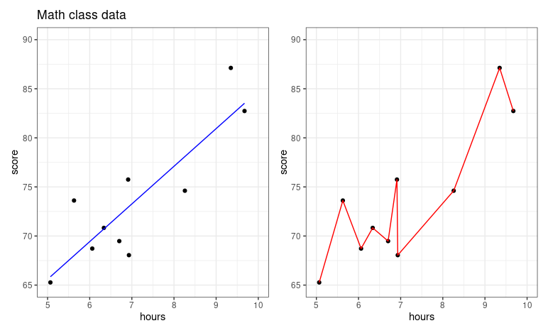
오른쪽 그래프 같은 경우에, 6.7시간을 공부했을때와 6.8 시간을 공부했을때 시험 성적에 있어서 매우 큰 차이를 보이고 있습니다. 논리적으로 맞지 않죠? 공부를 좀 더 했을 뿐인데, 시험 성적이 곤두박질 치고 있습니다.
때문에, 두 플롯을 비교해보았을때, 왼쪽에 위치한 predictive model이 좀더 reasonable한 모델이라고 평가할 수 있겠네요. 공부량에 비례해서 시험성적이 높아지고 있습니다. 오른쪽 플롯의 경우에는 특정 데이터를 너무 과하게 해석하고 있는 것 같네요. 이 현상을 우리는 overfitting(과대적합)이라고 부릅니다.
Overfitting with polynomials
Polynomials are quite powerful models and are capable of creating very complex predictive functions. The higher the polynomial degree, the more complex function it can create. 이번엔 degree에 따른 polynomial model의 형태를 살펴보겠습니다.
plot_deg_1 <- math_filled_in_range %>%
    mutate(y_pred = predict(lm(score ~ poly(hours, degree=1, raw=T), data=math), newdata=math_filled_in_range)) %>%
    ggplot( aes(x=hours, y=score)) +
    geom_line(aes(x=hours, y=y_pred), color='red')+
    geom_point(data=math, aes(x=hours, y=score)) +
    lims(x=c(5, 10), y=c(65, 90)) +
    ggtitle("Degree 1 polynomial") +
    theme_bw()

plot_deg_3 <- math_filled_in_range %>%
    mutate(y_pred = predict(lm(score ~ poly(hours, degree=3, raw=T), data=math), newdata=math_filled_in_range)) %>%
    ggplot(aes(x=hours, y=score)) +
    geom_line(aes(x=hours, y=y_pred), color='red')+
    geom_point(data=math, aes(x=hours, y=score)) +
    lims(x=c(5, 10), y=c(65, 90)) +
    ggtitle("Degree 3 polynomial") +
    theme_bw()

plot_deg_5 <- math_filled_in_range %>%
    mutate(y_pred = predict(lm(score ~ poly(hours, degree=5, raw=T), data=math), newdata=math_filled_in_range)) %>%
    ggplot(aes(x=hours, y=score)) +
    geom_line(aes(x=hours, y=y_pred), color='red') +
    geom_point(data=math, aes(x=hours, y=score)) +
    lims(x=c(5, 10), y=c(65, 90)) +
    ggtitle("Degree 5 polynomial") +
    theme_bw()

plot_deg_1 + plot_deg_3 + plot_deg_5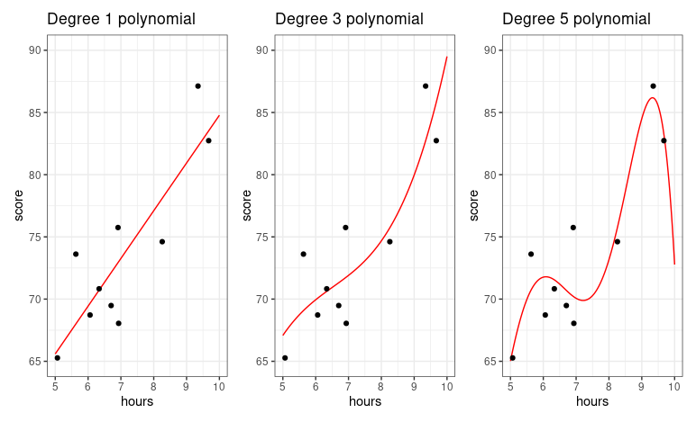
degree가 높아질수록, prediction function이 데이터를 더 완벽히 다루고자합니다. 이건 r^2(결정계수)을 이용해서 수치학적으로 해석할 수 있습니다. The r^2 value goes straight up as the polynomial degree goes up. Degree가 높을수록, r^2의 값은 커질 것 입니다. 하지만, 단순히 r^2값이 커진다고 해서, 그 모델이 데이터를 해석하는데 최적화된 모델이라고 증명하는 것은 아닙니다.
Train vs Test set evaluation
We are going to fit the model and evaluate the model with different datasets. 간략히, step을 나열해 보겠습니다.
- Split the observations into two parts
- Fit the model on the first part of the data
- Evaluate the model using the second part of the data
Here, the first part of data is called training data or training set and the second part of data is called test data or test set.
예시를 들어보겠습니다.
Let's illustrate train/test evaluation with the exam scroes from a biology class with 200 students. 여기서 우리는 두가지 모델을 구축하고 비교해볼 것 입니다 (Linear vs 5th degree polynomial). We are randomly selecting 80% of the observations for the training set, and putting the 20% of obeservations into the test set. 우리는 이것을 80/20 train/test set split이라고 부릅니다. 이때, 데이터는 무작위로 나뉘어집니다!
Hyperparamter tuning
'R 프로그래밍' 카테고리의 다른 글
| [R 프로그래밍] Functions (0) | 2025.03.11 |
|---|---|
| Evaluating and Improving and Predictions (0) | 2022.12.07 |

