
환웅 데이터
Evaluating and Improving and Predictions 본문
선형 모델(Linear model) is any model that predicts the y, often called as response variable or dependent variable, as a linear function of x; and this is called as predictor or independent varaible or explanatory variable. 어떤 선형모델을 그려낼지를 결정하는데 있어서 사용되는 방법들은 다양하지만, 이번 글에서 우리는 method of least squares에 대해 다루어 보고자 합니다. Method of least squares selects the line that minimizes the residaul sum of squares (RSS).
Evaluating the fit to your data
선형모델을 구축함으로써 다음 질문에 답할 수 있습니다.
What graduation rate would you expect for a state with a poverty rate of 15%?
This can be done by drawing a vertical line from where the poverty rate is 15% and finding where that line intersects your linear model. Predicted graduation rate은 해당 지점에서 만나는 y좌표의 값을 확인하면 될 것입니다. 어려운 내용은 아니죠?
poverty <- read_csv("https://tinyurl.com/stat20poverty")

p1 <- poverty %>%
  ggplot(aes(x = Poverty, y = Graduates)) +
  xlim(0, 20) +
  ylim(75, 96) +
  geom_point() +
  theme_bw()

m1 <- lm(Graduates ~ Poverty, data = poverty)

povnew <- data.frame(Poverty = 15)
yhat <- predict(m1, povnew)

p1 +
  geom_abline(intercept = m1$coef[1], slope = m1$coef[2], col = "goldenrod") +
  geom_vline(xintercept = 15, color = "steelblue", lty = 2) +
  geom_hline(yintercept = yhat, color = "steelblue", lty = 2)
대략 82.5정도로 추정되지만, 확실하게 하기 위해선 x에 15를 대입해보면 되겠죠? 대입해보면 82.85가 나옵니다. 자, 우리가 이번 노트에서 주되게 다룰 내용은 "How good of a prediction is 82.85%?" 입니다. 우리가 답할 수 있는건, how well our model explains the structure found in the data that we have observed 입니다. 우리는 predicted values 인 yhat i와, 실제 y값인 yi를 가지고 있습니다.
Measuring explanatory power: r^2
r^2 is a statistic that captures how good the predictions from your linear model y^(hat) are, by comparing them another even simpler model: y(bar).
R-squared (r^2)
결정계수라고도 부릅니다. 결정계수에 대해 설명하기 전에, 우리는 잔차(residual)이라는 개념에 대해 먼저 짚고 넘어가야 합니다. Residual is defined as the difference between an observed y-value(yi) and the expected y value(y^hat) under the model. 잔차란, 실제값과 예측값의 차이를 의미합니다. 위 그래프에서 실제값은 점으로 표기된 여러 좌표들의 y값이 될 것이고, 예측값은 회귀직선의 y값이 될 것입니다. 자 그럼 잔차는, 점들과 그래프상에 표시된 노란 선 y^(hat) 사이의 거리입니다. 회귀분석은, 잔차들의 제곱의 합을 최소화시키는 방법을 말합니다.
다시 결정계수로 돌아와서, R-squared is a statistic that measures the proportion of the total variability in the y-variable(total sum of squares, TSS) that is explained away using our model involving x(sum of squares due to regression, SSR). TSS는 실제 데이터값들의 y값에서 y값들(표본)의 평균을 일일이 빼고 제곱한 값들의 합을 의미합니다. SSR은 회귀직선의 y값(예측값)에서 y값들(표본)의 평균을 빼고 제곱한 값들의 합을 의미합니다.
R-squared의 값이 1에 가깝다면 회귀직선과 실제 데이터들의 거리가 밀접하게 분포되어 있을 것 이고 (이 경우, residual의 값이 작습니다), 0에 가깝다면 멀리 분포되어 있을 것 입니다 (이 경우엔 residual의 값이 크겠죠).
r^2은 언제나 0과 1 사이의 값만을 가집니다.
r^2이 0에 가까울수록, x 와 y는 선형 상관관계가 없다는 뜻입니다. (predictions less accurate)
r^2이 1에 가까울수록, x 와 y는 선형 상관관계가 있다는 것 입니다. (predictions more accurate)
Example: Poverty and Graduation
Poverty rate을 사용해서 graduate rate을 예측하는게 가능한지 실험하기 위한 선형모델을 구축해보겠습니다.
코드는 아래와 같습니다.
library(stat20data)
library(tidyverse)
library(broom)

poverty <- read_csv("https://tinyurl.com/stat20poverty")

m1 <- lm(Graduates ~ Poverty, data = poverty)

glance(m1) %>%
  select(r.squared)
여기서 m1은, vector나 data frame도 아닌, list라고 불리는 데이터 구조입니다. 리스트는 우리의 선형모델에 대한 정보를 저장하는 공간입니다. glance()와 같은 함수를 사용하기 위해선 broom 패키지를 불러와야합니다! glance()함수는 모형 성능을 정리해서 알려주는 함수입니다. 참고로, 위 코드를 실행시 결정계수의 값은 0.558이 나옵니다. 이를 토대로, poverty rate은 graduate rate에 대해 56%정도 설명하고 있다고 말할 수 있습니다.
Residual analysis
Friendly reminder, residual is the difference between an observed y value(실제 데이터값) and the expected y value(회귀모델로부터의 예측값). 코드를 살펴보기전에, 새로운 함수 augment()를 소개하겠습니다. glance()와 마찬가지로 broom패키지에 속하고, 모형을 각 데이터에 적용하는 함수입니다.
코드를 살펴보겠습니다.
1 numerical variable을 시각화하기 위해서 histogram을 이용하겠습니다.
poverty <- augment(m1, poverty) %>%
  select(State, Poverty, Graduates, .fitted, .resid)

poverty %>%
  ggplot(aes(x = .resid)) +
  geom_histogram()
According to the graph above, distribution seems to be reasonably symmetric. 여기서 잠깐, 우리의 예측이 다소 빗나갔음을 보여주는 지표(5%정도 벗어난)가 그래프에서 보여지고 있습니다. 코드를 통해 이부분을 살펴보겠습니다.
poverty %>%
  filter(.resid > 5 | .resid < -5)
# A tibble: 3 × 5
State Poverty Graduates .fitted .resid
<chr> <dbl> <dbl> <dbl> <dbl>
1 Montana 13.7 90.1 83.9 6.20
2 Rhode Island 10.3 81 87.0 -5.95
3 Texas 15.3 77.2 82.5 -5.26Now, we can investigate whether there is a systematic trend in where those residuals are occurring. Let's explore the relationship between the residuals of each observation and their poverty rate. 이 경우, two numerical variables를 시각화하기에 scatter plot을 사용하는 것이 효과적입니다.
poverty %>%
  ggplot(aes(x = Poverty, y = .resid)) +
  geom_point()
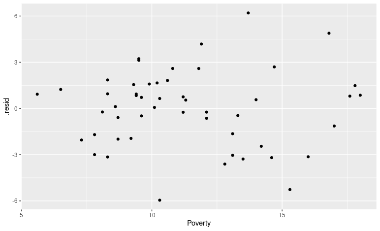
In general, our residuals were smaller(잔차값이 작기에, 예측도가 더 정확하겠죠?) for states that had lower poverty levels. At higher poverty levels (15% 주변) the residuals were becoming larger in magnitude(절대값의 크기를 확인해보면, 잔차들의 값이 크다는 점을 확인할 수 있습니다).
https://beaholic.tistory.com/11
R 프로그래밍 기초_R 자료형과 데이터 구조
R 프로그래밍 관련 다른 포스팅 2021/01/06 - [R 프로그래밍] - R 프로그래밍 기초_ R 기본 개념 & 설치 2021/01/06 - [R 프로그래밍] - R 프로그래밍 기초_R 스튜디오 설치 및 기본 셋팅 2021/01/09 - [R 프로그래
beaholic.tistory.com
'R 프로그래밍' 카테고리의 다른 글
| [R 프로그래밍] Functions (1) | 2025.03.11 |
|---|---|
| Overfitting (0) | 2022.12.07 |

